Skip to content
Toolkit
Marble is, at its core, a component toolkit. It offers pre-built, pre-styled components that you can use to craft personalized layouts and themes.
Not every component is listed on this page.
For an example to see the components in action checkout Aylur/marble-shell. There is a new work in progress website which will have a more comprehensive list.
Primitives
Avatartsx<Avatar r={17} size={74} fallbackIcon="folder-user" filePath={`/var/lib/AccountsService/icons/${GLib.get_user_name()}`} />Bartsx<Bar position="top" start={<MyBarStartComponent />} center={<></>} end={<></>} />There is also a
BarCornerscomponent which pairs nicely with bars.tsx<BarCorners position="top" r={13} />Boxtsx<Box gap={5} mx={5} my={12} p={5} vertical> Box content </Box>Buttontsx<Button flat r={5} px={3} py={5} onPrimaryClick={() => print("clicked")}> Button content </Button>CalendarGridtsxconst [date, setDate] = createState({ year: 2025, month: 6 }) return ( <CalendarGrid date={date}> {(date) => ( <Button onPrimaryClick={() => setDate(date.get())}> <Text>{date((d) => `${d.day}`)}</Text> </Button> )} </CalendarGrid> )Icontsx<Icon icon="system-search" fallback="image-missing" />Modaltsx<Modal m={15} open={open} onClose={setOpen}> Modal content </Modal>
Indicator components:
BatteryIndicatorBatteryLabelBatteryLevelBarBluetoothIndicatorClockLabelHyprlandClientsHyprlandWorkspacesMediaIndicatorMicrophoneIndicatorNetworkIndicatorNotificationsIndicatorPowerProfilesIndicatorSinkTypeIndicatorSpeakerIndicatorTrayItemsUptimeLabel
Notifications
tsx
<NotificationPopups anchor="top-right" timeout={3000}>
  {() => (
    <NotificationRoot hideOnHover>
      <Box hexpand vertical>
        <Box>
          <NotificationAppIcon />
          <NotificationAppName opacity={0.8} />
          <NotificationTimestamp opacity={0.7} />
          <NotificationDismissButton flat color="error">
            <Icon icon="window-close" />
          </NotificationDismissButton>
        </Box>
        <Separator />
        <Box>
          <NotificationImage size={86} />
          <Box vertical>
            <NotificationSummary />
            <NotificationBody />
          </Box>
        </Box>
      </Box>
    </NotificationRoot>
  )}
</NotificationPopups>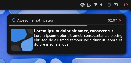
MediaPlayer
tsx
<MprisList>
  {() => (
    <Box>
      <MprisCoverArt />
      <Box vertical>
        <Box>
          <MprisTitle />
          <MprisArtist />
          <MprisRaiseButton flat>
            <MprisBrandIcon />
          </MprisRaiseButton>
        </Box>

        <MprisPositionSlider />
        <Gtk.CenterBox>
          <MprisPositionLabel $type="start" />
          <Box $type="center">
            <MprisPrevButton flat>
              <Icon icon="media-skip-backward" />
            </MprisPrevButton>
            <MprisPlayPauseButton flat>
              <MprisPlayStatusIcon />
            </MprisPlayPauseButton>
            <MprisNextButton flat>
              <Icon icon="media-skip-forward" />
            </MprisNextButton>
          </Box>
          <MprisLengthLabel $type="end" />
        </Gtk.CenterBox>
      </Box>
    </Box>
  )}
</MprisList>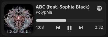
Theming
Most components take in Tailwind style props for border-radius, margin and padding.
For more customized styles there is a builtin useStyle hook, which can be used to defined scoped CSS for each component.
ts
function MyComponent() {
  const style = useStyle({
    "background-color": "red",
    "border": "2px solid blue",
    "&": {
      ">child": {
        "border-radius": "12px",
      },
    },
  })

  return <Box class={style} />
}
The default theme is derived from Adwaita, but you can customize it to your liking using the Theme API or apply global CSS.
ts
import { css, calc, variables as v } from "marble/theme"

// globally apply CSS making use of CSS variables used by Marble
void css`
  tooltip {
    background-color: ${v.bg};
    margin: ${calc(v.spacing, 7)};
    padding: ${calc(v.padding, 5)} ${calc(v.padding, 7)};
    border-radius: ${calc(v.roundness, 9)};
    border: none;
    box-shadow:
      ${v.shadow.sm},
      inset 0 0 0 ${v.borderWidth} ${v.borderColor};
  }
`

import { Theme } from "marble/services"

const theme = Theme.get_default()

const nucharm = new Theme.Stylesheet("Nucharm", {
  stylesheet: {
    dark: {
      bg: "#151516", // overrides the above used `${v.bg}` value
      fg: "#cfcfcf",
      primary: "#51a4e7",
      success: "#00d787",
      error: "#e55f86",
    },
    light: {
      bg: "#fafafa",
      fg: "#090909",
      primary: "#426ede",
      success: "#009e49",
      error: "#b13558",
    },
  },
})

theme.addTheme(nucharm)
// can be later activated, e.g through a widget
nucharm.activate()
Launcher
Marble exports two components PickerModal and PickerEntry to build a UI for Gnofi.
tsx
const gnofi = new Gnofi.Gnofi({ keys: Gdk, commandLeader: ":" })

// add a search provider picker
const filesProvider = new Gnofi.SearchPicker({
  command: "f",
  maxItems: 6,
  icon: "org.gnome.Nautilus",
  description: _("Search files using Nautilus"),
  provider: {
    busName: "org.gnome.Nautilus",
    objectPath: "/org/gnome/Nautilus/SearchProvider",
    desktopId: "org.gnome.Nautilus.desktop",
  },
})

picker.addPicker(filesProvider)

return (
  <PickerModal gnofi={gnofi}>
    <Box vertical>
      <PickerEntry gnofi={gnofi} />
      {/* UI for each Gnofi picker */}
    </Box>
  </PickerModal>
)
TIP
You can use Gnofi.findProviders to get a list of installed apps that can be used as providers.
OSD
tsx
<OSD vertical halign="end" valign="center" />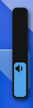
Lockscreen
tsx
<Lockscreen open={lockscreenOpen} onUnlock={setLockscreenOpen}>
  {({ loading, error, unlock }) => (
    <>
      <Box $type="overlay" halign="center" valign="start">
        <ClockLabel mt={120} weight="bold" size={7.4} format="%H:%M" />
      </Box>
      <Box $type="overlay" halign="center" valign="center">
        <Box>
          <Gtk.PasswordEntry
            $={(self) => onMount(() => self.grab_focus())}
            showPeekIcon
            onActivate={({ text }) => unlock(text)}
          />
          <Adw.Spinner visible={loading} />
        </Box>
        <Box halign="center" valign="end">
          <Text visible={error} color={v.error}>
            {_("Authentication Failed")}
          </Text>
        </Box>
      </Box>
    </>
  )}
</Lockscreen>